 Have you noticed a change in some of your favorite apps over the past few years? Instagram’s controversial logo change; Airbnb’s swap from a photo-filled app background to plain white; Apple Music’s decision to remove almost all text and display album covers front and center. Perhaps you’ve noticed other apps you love transitioning to fewer colors, a simpler art style, more white space, or concise typography?
Minimalist app design has taken over.
This isn’t an accident. In a journey to deliver the best experiences to users, app companies adopt the design styles that work best for users. Minimalism isn’t just an aesthetic choice; this style delivers an exceptional user experience, which has prompted many of today’s popular apps to take the minimalist plunge.
What makes for great minimalist app design? Read on to find out.
One of the key factors at play in minimalist design is color choice. In the early days, developers and designers were eager to explore photo backgrounds and palettes of multiple colors. Now, these choices make apps feel more cluttered and overwhelming than exciting. Minimalist design approaches color in two different ways:
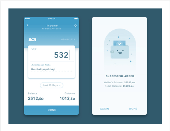
This scheme is made up of shades, tints, and tones within one hue. Various colors are created by changing the hue brightness and saturation. The result is a color palette that’s very easy on the eyes, although its main disadvantage is the lack of color for accents and highlights. This wallet app design makes great use of monochromatic color, using blue as its hue and supporting it with lighter and darker versions of the main color.
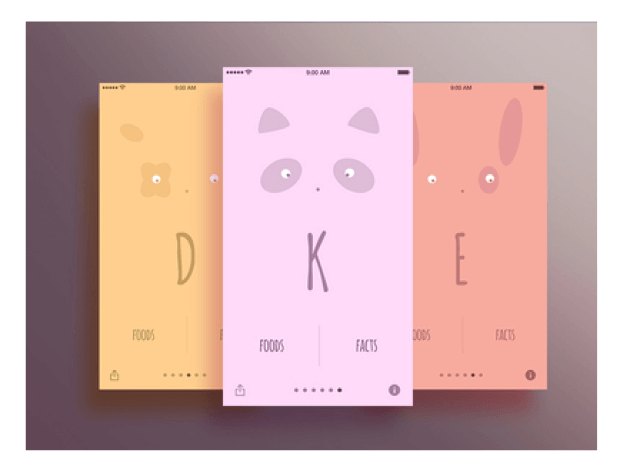
This scheme uses three colors that sit next to each other on the color wheel, to highlight different aspects of the app. Each color, for instance, may be used to designate the level of categories. Bold colors are typically used to designate important aspects. This vitamin app design uses purple, yellow, and orange as its analogous color scheme.
The goal of typography within an app is to establish clear communication of the app’s purpose, and help users achieve that purpose. The purpose of Instagram is to post images and comment on others’ images. For Spotify, it’s searching for and playing music.
Minimalist app typography focuses on using one typeface throughout. Multiple typefaces — even if used for different categories — can give your app a sloppy, disorganized feel. Instead, designers use varying sizes, styles, and weights within one typeface to create these differences while giving a cohesive feel for the app as a whole. With some exceptions, most apps focus on using the OS’s standard typeface (Noto and Roboto for Android, San Francisco for iOS) as they are simple and easy for users to read.
Apps need to organize and divide information for easy user navigation, yet traditional divider lines are becoming less common. That’s because there’s only so much space on mobile devices. Too many lines can result in a cluttered interface.
Minimalist design relies on spacing, shadows, and blocks to divide information without filling the screen up with lines. Indeed, white space is referred to as the “backbone” of minimalist app design. White space gives apps a simplified yet refined look that’s pleasing to the eye.
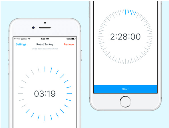
White space also enhances the chosen typeface and colors, allowing them to stand out amid an overall minimal background. Apps like Ghani Pradita and Apple’s Timer are two fabulous examples that successfully use white space to organize information for the user.
There are many ways to enhance or highlight app information with minimalist design. Some apps use bold color, or a contrasting color against a generally neutral color scheme for calls to action. These colors draw the user’s attention to important next steps (more on this in our next section). Another option is increased font size, which should only be used to spotlight your app’s most important information.
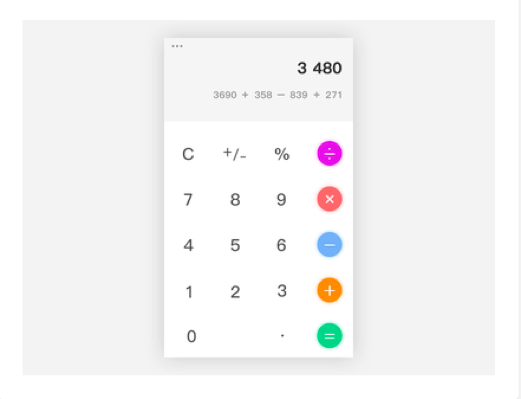
Some minimalist apps get more creative to highlight important information. Shadows and elevation are great division options, apart from white space or traditional lines. Even in straightforward apps like calculators, shadows can enhance the app’s look. Blurring backgrounds is another way to focus the attention on particular menu or action.
Keep in mind, among all successful apps that use a minimalist design style, minimalism isn’t a goal in itself. The goal of app design remains true to its purpose for users, and minimalism is simply a tool used to achieve that purpose.
Accessible design, for instance, is particularly important for people with disabilities (e.g. blindness) to access your app. One of the benefits of minimalism is that it can accommodate accessibility guidelines and create excellent experiences for everyone.
Apps have been pervading mobile devices for a decade now, and we are continuing to gather feedback and learn more about creating excellent user experiences. Minimalism has popped up recently as a popular — and very effective — app design style to achieve a successful user experience. When designing your own app, don’t shy away from minimalism for fear that it may make your app look too much like others in the Apple and Google stores. Today’s hottest apps have adapted this style for very good reason; before you push away from the “trendy” design style for the sake of standing out, consider carefully whether minimalist design may deliver your users the best experience for your app’s purpose. Interested in designing a minimalist style app? Get in touch with our experienced team of developers today!
4241 Jutland Dr., Suite 300
San Diego, CA 92117