 Looking to launch the next hot ecommerce app? You can learn a thing or two from the biggest grocery shopping apps that have captured what was once a strictly brick-and-mortar market.
Picture this: you sit down to eat a bowl of your favorite granola, with berries and yogurt. It’s sweet and crunchy, with the perfect ratio of nuts to oats. You’re using your favorite retro sundae glass to highlight those delicious layers (while you’re at it, you may as well post a quick pic to Instagram, right?).
This bowl of granola is more than just your breakfast; it’s the perfect blend of User Interface (UI) design and User Experience (UX) design.
UI and UX are part of virtually every product you use. In the case of your breakfast, the nourishing blend of granola, fruit, and yogurt is the UX. The bowl that makes your morning fuel Instagram worthy is the UI.
How you bought that granola and yogurt in the first place is another story, but one in which UI/UX is equally important. Consumers are increasingly favoring the UX provided by shopping apps instead of the UX found when walking amid grocery aisles, picking out ripe tomatoes (or, frozen pizza rolls and bakery cheesecake). Today’s hottest grocery shopping apps are gaining more users every day, because they deliver a smooth, supportive experience and eye-catching, functional aesthetics.
Get ready to take notes. Here are some of the top UI/UX lessons we can learn from the leading grocery apps.
Apps are all about convenience — signing up shouldn’t take longer than a trip to the grocery store.
Popular grocery apps like Instacart offer the option to sign up via Facebook or Google+; A connected account sign up means fewer passwords to remember, and a one-touch start.
While most users love this convenience, it’s a good idea to offer a traditional sign up form as well, for those wary of connected accounts. Traditional doesn’t have to mean complicated; Instacart’s traditional sign up form includes only five fields to fill out. Take the hint: the easier and faster it is to become a user, the more people will give your app a try.
It’s hard for grocery shoppers to stick to a budget with that bag of chips sitting right in front of you, begging you to pick it up. Staying on budget and accurately predicting the cost of a trip to the grocery store is one of the major complaints of in-store shoppers.
Where the physical store fails, your app can triumph. Adding a feature that clearly reflects the cost of the shopper’s virtual basket helps reduce post-purchase regret — and improves your customer’s chance of return.
It may seem counterintuitive, because you want people to spend more but, by giving your shoppers a visual aid to help them stick to their spending goals, you can actually foster a more positive shopping experience. You’re doing one better than the physical store, by solving a common problem consumers face when shopping.
They may spend less with you in a single shopping trip than they would in a store, but they’re much more likely to choose your app over and over. Customer loyalty is worth much more than the revenue from one transaction.
When you put your basket down to check your grocery list or answer a text in the store, you assume it won’t go anywhere. Shoppers love an app that mimics this — across different devices.
Companies like Tesco in the UK offer a desktop feature that syncs to a user’s phone app, ensuring that the cart a shopper began filling on his phone is also accessible on his desktop (or any other device he may use to complete the order).
Designing for continuity means tailoring the existing layout and functions of your app to various devices, to create a smooth transition between them. If a user creates a shopping list on her laptop, she should see that same list waiting for her when she opens the app on her mobile phone to continue shopping.
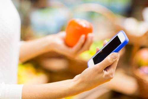
Barcode scanning is one of the most popular features of most grocery apps, and a fabulous example of how a digital app can complement the in-store experience.
BagIQ helps shoppers stay on budget by tallying their items by barcode as they shop. Apps like ListEase make it easy for shoppers to add products they’ve bought before and want to reorder, by simply scanning them — without any searching, typing, or hassle.
Incorporating a feature that allows your app to interact with the physical store products is a great way to capture new users. A consumer may not be ready to take grocery shopping entirely online, but may use an app to quickly scan the pantry and make a list. Do research into consumer shopping behaviors in your brick-and-mortar stores, and think about how your app can add convenience to that experience.
From coffee stamp cards to frequent shopper clubs, loyalty programs are a great way to engage and reward your customers. Good UI/UX design will help you maximize the impact of your loyalty program.
One of the best ways to get more customers to use your loyalty program is to simply remind them that they can. Canada’s popular PC Plus program helps users track their points online, and notifies them of weekly offers as they come up, to encourage strategic purchasing.
Your app’s UI/UX should also be designed to gamify your rewards program for users. After all, the appeal of a loyalty program is the thrill of racking up points and “winning” something. Give users a satisfying animation whenever they achieve a new prize, or a motivating visual that tracks their points, and you’ll find them coming back again and again for those sweet rewards.
No one has time to read 1,000 words on their phone. When you’re searching for your favorite cereal at the store, you look for the bright color of the box (and perhaps an iconic cartoon character) to find it quickly. Consumers want the same ease of searching and finding eye-catching products digitally.
Popular grocery chain Morrison’s uses images that mimic the visual inventory of a grocery cart. Using images with no text (or minimal text) helps people quickly find the products they’re looking for. Images also allow users to visualize their haul better when they look at their virtual carts. Make it just as easy and aesthetically pleasing to scroll through products on the screen as it would be to walk down the aisles in a brick-and-mortar store.
Apps offer unique opportunities to engage your customers, outside of strictly advertising your own products. Grocery stores like Whole Foods and Wegmans include recipe features in their apps, allowing shoppers to create grocery lists based on specific recipes, or vice versa: to find recipes based on ingredients they already have on hand.
The recipe feature adds value to the user’s experience, while encouraging increased purchasing. Try to find something relevant to the way consumers use your products, and design your app to support it. You may build app features to introduce shoppers to some of the specialty items you stock, announce brand new products, or inspire creative ideas for using your products.
One thing all the leading grocery apps have in common: they recognize that the app is not just a tool to sell groceries — it’s a tool to sell the brand.
The most successful grocery shopping apps aren’t working at odds with their brick-and-mortar counterparts. They’re working to enhance the entire brand, whether shoppers choose to get their food online or in the physical store. This is where UI becomes extremely important. Your app should echo everything from the colors, to the font, to the tone of your brand. If this isn’t your area of expertise, don’t be afraid to reach out for help. At Barefoot Solutions, we pay close attention to both the consumer experience and your brand image. Our designers excel in carrying your branding through to your app.
At the end of the day, your ecommerce app should focus on serving your customers. Some of the biggest turn-offs for users include a complicated interface and a lack of clear instructions. If your app doesn’t make it easier and more pleasant for them to shop, why would they choose it over the brick-and-mortar store, where they already know how to find what they want? If you want to ensure you’re truly meeting the needs of your target market, Barefoot Solutions can help you with market research and audience insights to determine what your customers want — and then work with you to design an app that delivers.
Consumers are hungry for convenience, and designing an effective UI/UX is one of the best ways to satisfy it.
4241 Jutland Dr., Suite 300
San Diego, CA 92117